web typography
A friendly tutorial about web fonts and basic typographic principles
"Web typography" refers to the appearance of all the text on your website. It includes basic CSS text properties like what font to use and whether it should be italic or not, but typography is much more than that. It's about the space between and around letters, words, and lines. It's the size of different runs of text in relation to one another, and the history behind each font family.
font families and font faces
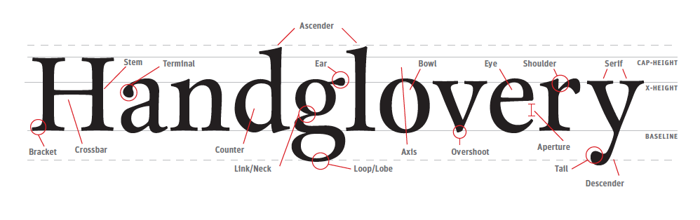
A single font "family" is made up of multiple font "faces" . Each font face is a different weight or style in the family. "Weight" refers to the boldness of a particular face, and "style" refers to whether it's roman (upright), italic, condensed, extended, or some other variant in the family.
In CSS, font weights are expressed as numeric values between 100 and 900. Fortunately, there are relatively standardized, human-friendly terms for each of these numeric values. "Black" usually means 900, "bold" is 700, "regular" is 400, etc. As you can see above, most families don't supply a face for every single weight. Roboto is missing "extra light" (200), "semi bold" (600), and "extra bold" (800).
line length
A good rule-of-thumb is to limit the number of characters on a single line to around 80. Like alignment, this subtly affects the readability of your content. It takes energy for your eye to move from the left edge of a paragraph to the right, and the farther it has to scan, the faster it gets tired. Longer lines also make it easier to get lost when you finish a line and need to jump back to the beginning of the next line.
text alignment
The alignment of text has a subconscious impact on how you read it. You've probably never noticed it before, but your eyes don't move in a smooth motion as they read over a paragraph - they jump from word to word and from line to line. Your eyes fixate on certain spots and skip over other ones.
n a well-designed HTML document, text alignment is never an arbitrary decision. It takes into account this little bit of human physiology. Good text alignment actually makes it easier for users to read your content by giving their eyes an anchor to jump to when they move from line to line.
summary
The goal of this chapter was twofold: - Learn the mechanics of web fonts and basic CSS typography properties. - Understand how designers think about typography.You might not be able to create a beautifully typeset web page from scratch after reading this chapter, but that wasn't the point. It was to make you aware of the invisible art of typography. You should now have the vocabulary to talk about things like font families, faces, weights, and styles, as well as leading, measure, and vertical rhythm.
The most important thing you should take away from this chapter is the fact that nothing is arbitrary in a well-designed web page. The font sizes, indent style, text alignment, line height, margins, and every other tiny facet of the page was carefully considered. There was a purpose behind all of these decisions.